‘Let’s Be Healthy’
I produced a title sequence to represent a healthy lifestyle documentary called, ‘Let’s Be Healthy’.The intention of the title was to propose to the audience that they could be involved in getting healthy.
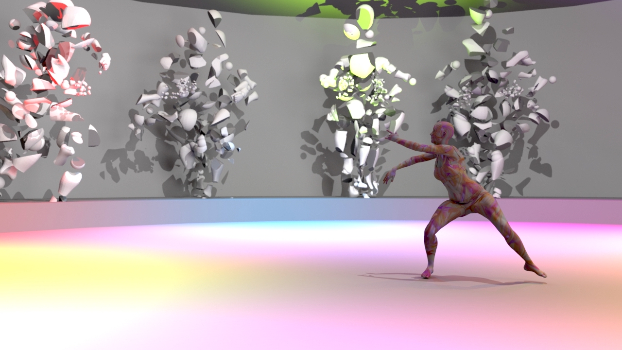
Lola showed by the theory of colour associations that a healthy lifestyle could be fun and exciting. She picked the exact colours to depict the emotion she wanted the audience to experience. For example, colours such as green symbolises health and growth, while yellow represents happiness. The different blending modes for the colours and shapes created anticipation of what was coming next. This would keep the audience engaged and intrigued to know what the shapes were going to become. They were subconsciously being put into a good mood because of the colour schemes and the cheerful music.
The title sequence created for the TV shows, ‘Marco Polo’ and Nike’s original web series, ‘Margot vs Lily’ had a straightforward approach to projecting the concept of the shows to the audience and this inspired the visual theme for Lola’s artwork ‘Let’s Be Healthy’. By adding phases such as ‘Let’s be active’, the audience would have a glimpse into what the documentary was going to be about.
‘Let’s Be Healthy’ achieved the project brief’s requirement because everything in the artwork was related to being healthy. There was a correlation of fruits, vegetables, character rigging and a moving bicycle, entirely handmade by Lola. The vector fruit and vegetable illustrations all came together to spell the word ‘healthy’.